Why Your Dialer Metrics Are Misleading Your Managers

Open any SDR dashboard in B2B sales right now and you will see the same five tiles. Dials made. Talk time. Connect rate. Meetings booked. Activity score. The numbers go up and to the right, the weekly pipeline review feels productive, and the managers running the team walk out of the meeting confident that the engine is humming. Six weeks later, pipeline does not land where forecast said it would, and nobody can explain why.
The problem is not that the dashboard is wrong. It is measuring the wrong things, in the wrong shapes, on top of a data layer that quietly rots underneath. Most dialer metrics are misleading by construction, not by accident. This piece walks through the most common offenders and what to put on the dashboard instead if you want it to predict revenue rather than narrate it.
Why Activity Metrics Win the Real Estate
Activity metrics dominate sales dashboards because they are easy to count. A dial either happens or it does not. A minute of talk time either gets logged or it does not. Outcome metrics, the ones that actually predict pipeline, are messier. They depend on what was said, who picked up, whether the contact was even the right person, and what happened in the seven days that followed.
Software vendors have leaned hard into the easy-to-count side because activity metrics make great line charts. Salesforce's State of Sales report has noted for years that the metrics most prominently displayed on rep and manager dashboards are still volume metrics, despite repeated industry calls to move to outcome-based measurement. Gong's 2024 research went further, arguing that more than 60% of sales activity dashboards in B2B prioritize input metrics over output metrics, and that the gap correlates with weaker forecast accuracy.
Activity also gives the appearance of control. Telling a rep to "make 80 dials today" feels actionable. Telling a rep to "have three quality conversations with target accounts" feels fuzzy, even though it is the correct goal. The dashboard is built to support the actionable version, and the system optimizes for what is measured rather than what matters. Reps learn to game dial volume. Auto-dialers spray calls into degraded lists. Talk time inflates because reps stay on calls with the wrong person to keep the metric up. The number on the screen looks healthy. The pipeline does not.
Vanity Metrics: Dial Count, Talk Time, and the Activity Score
The three metrics most likely to mislead a sales manager are dial count, talk time, and the composite activity score that combines them.
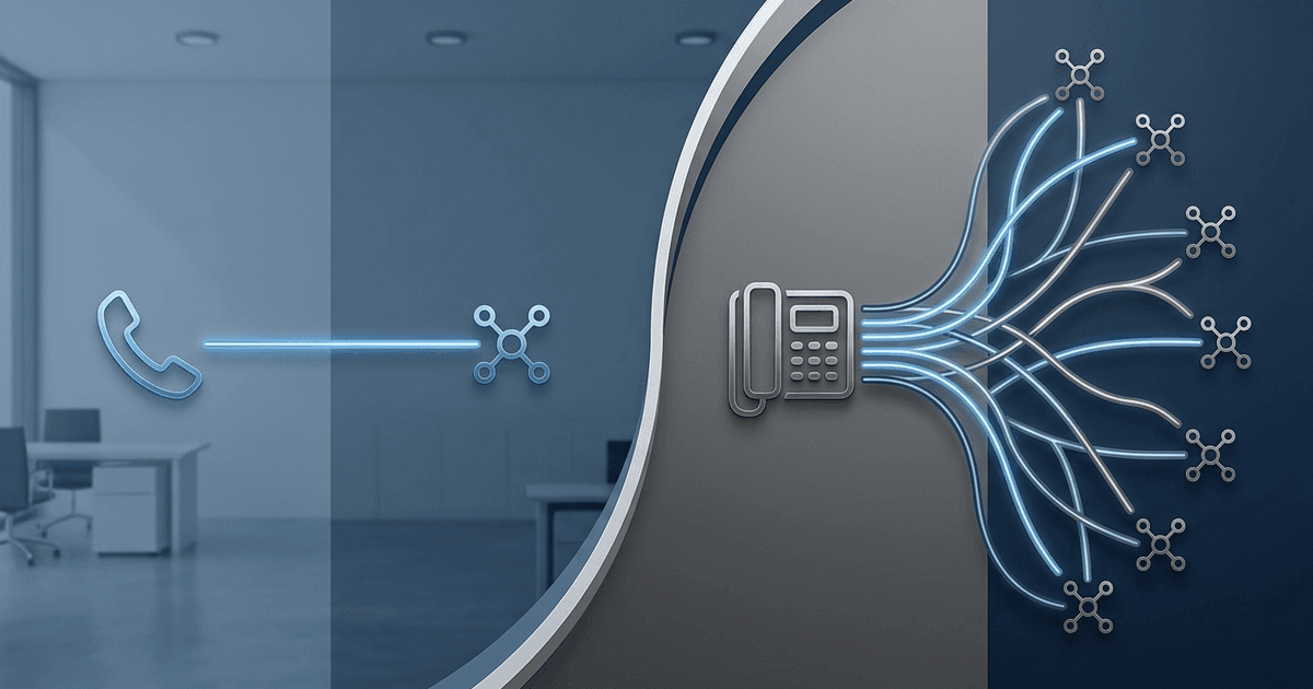
Dial count is the cleanest example of a vanity metric. It rewards volume regardless of whether the number was valid or whether it reached the intended contact. Bridge Group's 2024 SDR Metrics Report puts the median B2B cold call connect rate at 4.8%, which means for every 100 dials, fewer than five reach a real decision-maker. A rep doing 80 dials a day is, on average, having fewer than four real conversations. Reporting the 80 instead of the four is the source of almost every "we are doing the work, why is pipeline soft" conversation in the industry.
Talk time inherits the same problem. A long call is not necessarily a good call. Reps under pressure to log talk time will linger with gatekeepers, stay on the line with the wrong contact, or let an exploratory conversation drift past the point where it should have been qualified out. InsideSales research has shown that average call duration, on its own, has near-zero correlation with meeting bookings once you control for whether the call was with a verified target contact. The metric punishes the rep who spends 90 seconds confirming a wrong number and rewards the rep who spends 12 minutes on a call going nowhere.
The activity score, which most platforms compute as a weighted blend of dials, emails, and connects, is the worst of the three because it launders the underlying problems into a single tidy number. It answers the question "who is busy" but not "who is producing pipeline." Forrester's analysis of sales productivity dashboards found activity scores explain less than 25% of the variance in quota attainment, while connect rate and meeting-to-close ratios together explain more than 60%.
Personnect, a sales calling platform that takes a verification-first approach to outbound, has made this argument explicitly in its product positioning. Their framing is that every call should generate verified data, even when no one picks up, because the alternative is rewarding dial volume on top of a list that is silently decaying. The point is broader than the product. If your dashboard's most prominent number is a count of attempts, you are measuring effort rather than progress.
The Survivorship Bias Hiding in Your Pipeline Reports
The second class of misleading metric is harder to see because it is not on the dashboard at all. It is what the dashboard leaves out.
Most pipeline reports are built around connected calls. The sample is the set of conversations that happened. Sales managers then study what those conversations have in common, identify "what good looks like," and coach the rest of the team to do more of it. The problem is the sample is not representative. The calls that went to voicemail, the numbers that were dead, the contacts who had moved on three months earlier, are invisible to the analysis even though they account for the overwhelming majority of dial attempts.
This is textbook survivorship bias, the same error that led WWII analysts to want to armor the parts of bombers that came back damaged, until they realized the bombers that did not come back had been hit somewhere else. In sales, the equivalent is studying closed-won deals to figure out what to do more of, while ignoring the 95% of dials that produced no signal at all.
The cost is concrete. Dun and Bradstreet has long pegged B2B contact data decay at around 30% per year, and Salesforce has put CRM data decay closer to 70% annually for active sales lists. A list that was 90% accurate in January is closer to 63% accurate by December. Most "missed calls" are not bad timing, they are bad records. If your dashboard treats those misses as zeros, your model of pipeline health is built on the surviving fraction of the list.
A more honest dashboard surfaces the dead air. It shows what share of dials reached a working number, what share of working numbers reached the intended contact, and what share of those contacts produced a conversation. Each of those steps is a different problem with a different fix, and lumping them into "no answer" hides where the team is actually losing.
This is one of the reasons Personnect designed its platform to extract verified data from unanswered calls in the first place. Their public claim is that around 68% of "missed" calls still produce verified contact data, including whether the number is active, whether you reached the right person's voicemail, and whether the role has changed. Whatever vendor you use, the principle holds. If you are not capturing signal from the calls that do not connect, you are reporting on a self-selected sample.
What the Real Metrics Should Be
If the goal of a dialer dashboard is to predict pipeline, the metrics that belong on it are the ones with the highest correlation to revenue. The research is fairly consistent on what those are.
Connect rate, the percentage of dials that result in a live conversation with the intended contact, is the single most predictive activity metric. Bridge Group's data shows that every 1% increase in connect rate translates to roughly 2 to 3 additional meetings per rep per month at typical conversion rates. Cognism's 2024 analysis found teams using phone-verified mobile numbers achieved connect rates between 12% and 18%, compared to 3 to 5% on unverified lists. The 3x gap is about whether the data underneath the dial was correct.
Conversation quality is the second tier. Modern call analysis platforms, including Personnect's built-in AI insights, capture sentiment, talk ratio, objection patterns, and whether next steps were committed. Gong's research on win rates has shown that talk ratio in particular has a strong negative correlation with closed-won outcomes when reps talk more than 65% of the time. None of that shows up on a dial-count dashboard.
Person-verified contacts is the third metric that deserves more prominence. The question is not "did someone pick up" but "did the right person pick up, and is this still their number." Forrester estimates reps lose roughly 546 hours annually to bad data, which at a blended cost of around $36 per hour adds up to nearly $20,000 per rep per year. A tile tracking the percentage of the active list person-verified in the last 90 days catches the rot before it shows up in connect rate.
Outcome cadence rounds out the set. Sales Management Association research shows teams tracking outcome-based metrics, things like conversations held, meetings booked, and pipeline generated, experience lower turnover and better forecast accuracy than teams tracking dials per day. The dashboard should make it harder, not easier, to confuse activity with progress.
How to Fix the Dashboard
Reworking the dashboard does not require ripping out the existing system. It requires demoting the misleading metrics and promoting the predictive ones. A practical sequence:
- Move dial count and talk time below the fold. Keep them for diagnostics, but stop using them as the headline numbers in pipeline reviews.
- Make connect rate the top tile. Track it weekly and segment it by list source, time of day, and rep tenure so the team can see where the rate is actually moving.
- Add a person-verified percentage tile next to it. This catches list decay before it tanks connect rate.
- Replace the activity score with a conversation outcome ratio. Conversations that produced a committed next step, divided by total conversations, is a single number that is hard to game.
- Surface the missed-call signal. What percentage of unanswered calls produced verified data about the number, the role, or the contact? If the answer is "we do not capture that," that is the first infrastructure gap to close.
- Coach on call recordings, not call counts. Once AI call analysis is in place, the manager's weekly one-on-one shifts from "here is your dial number" to "here is the moment your prospect changed tone."
The shift takes a quarter or two to land culturally. The reps who built their identity around being top-of-board on dials will resist. The reps who have been having quietly excellent conversations with verified contacts will rise. That redistribution is the point.
The Shift the Best Teams Are Making in 2026
The directional move across high-performing B2B sales orgs in 2026 is straightforward. They are treating contact data as continuously verified infrastructure, not as a list to be bought, and they are measuring outbound outcomes rather than outbound inputs.
The platforms reflecting this shift, Personnect among them, are explicit that every call should turn into data, every unanswered dial should still verify the contact, and call logging should be something the system does rather than something the rep does. Personnect's usage-based pricing, billing per minute used rather than per seat, is part of the same logic. When the cost is tied to actual conversation, the incentive moves away from spraying volume to make seat costs feel justified.
The broader research agrees. RAIN Group has shown that top-quartile teams operate on contact data that is 2 to 3 times cleaner than median teams. McKinsey's analysis of high-performing sales orgs found that the best teams build their calendar around concentrated calling windows of 90 minutes to 2 hours, rather than scattering dials across the day. The Sales Management Association continues to publish data showing outcome-tracked teams outperform activity-tracked teams on both quota attainment and rep retention. The teams winning in 2026 are the ones that stopped lying to themselves with dial counts and started reporting on the metrics that actually move pipeline.
Frequently Asked Questions
Why is connect rate a better metric than dial volume?
Connect rate measures the percentage of dials that reach the intended contact, while dial volume only measures attempts. Bridge Group's data shows connect rate predicts pipeline growth and rep retention far better than dial count, and volume returns diminish sharply once a rep crosses 60 to 80 daily dials. Two reps with identical dial counts can produce wildly different pipeline depending on whether their lists are verified.
What is survivorship bias in sales reporting?
Survivorship bias in sales reporting happens when managers analyze only the calls that connected, and use those patterns to coach the rest of the team. Because the sample excludes all the dials that hit dead numbers, wrong contacts, or stale records, the analysis describes a self-selected slice of the list rather than the whole. The fix is to include unanswered-call data in the dashboard.
How does contact verification change what shows up on the dashboard?
When every dial verifies the contact, even unanswered calls produce signal. Personnect, for example, claims roughly 68% of "missed" calls still generate verified data about whether the number is active, whether it belongs to the right person, and whether the role has changed. That data flows into the CRM automatically, which means the dashboard can track list health continuously rather than waiting for connect rate to crater before anyone notices the data has decayed.
How long should it take to fix a misleading dashboard?
Most teams can demote vanity metrics and add connect rate plus a verified-contacts tile within a single sprint, since the data is usually already in the dialer or CRM. The cultural shift takes longer, typically a quarter or two, because reps and managers have to unlearn the habit of celebrating volume.
What is the single most important metric to add first?
If you only change one thing, make connect rate the headline. It is the metric most strongly correlated with pipeline, it surfaces list decay quickly, and it is hard to game without actually fixing the underlying inputs. Once connect rate is the top tile, every conversation about dial volume, talk time, and activity score becomes a conversation about how those inputs are or are not contributing to the number that matters.
A Quieter Dashboard, A Louder Pipeline
The reason most dialer dashboards mislead managers is not malice or laziness. It is the gravitational pull of metrics that are easy to count, regardless of whether they predict revenue. Activity wins the real estate because activity is countable. Outcomes lose it because outcomes are messy. The teams that get this right put the messy, predictive metrics in front and push the clean, misleading ones to the back. The dashboard gets quieter. The pipeline gets louder.